
I love color. It’s one of the most important parts of who I am as a person and as a designer. My life has revolved around color since I was a little kid, and has always been a focal point of the things I surround myself with. I’d say it’s one of the most important components of the work I do everyday, too. I can even hear it in my head.
Suffice to say, it’s intensely puzzling to me why so many people are afraid of it.
Over the course of my career, I have been fortunate to be creative within a multitude of industries—healthcare, automotive, telecom, tech, housewares, legal and motorsports. Today, in a position to manage brands for industrial and manufacturing companies, I have had a front-row seat to a strange phenomenon—a widespread fear of color.
What is driving that fear? I believe that in many instances, it has to do with fitting into the competitive landscape and minimizing risk.
Yep, I said it.
There is a strong chance that the color of your company’s logo has more to do with being comfortable and playing it safe than conveying sophistication, practicality or timelessness.
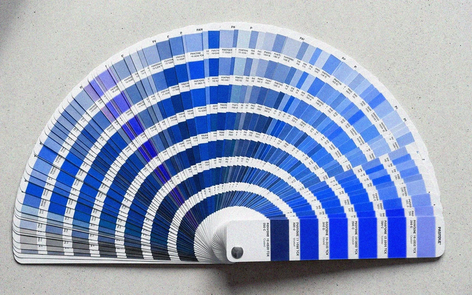
You can have any color you like, as long as it’s blue.
Specifically and mostly, I’m referring to the color blue. Blue is overwhelmingly the color of choice in manufacturing (and also many other industries) because it is a low risk path for a corporate brand. It’s not offensive to any one group of people. It’s understated and simple. It’s assumed to be masculine and strong. People like blue. Blue is an easy choice when faced with doing something that people may read into literally or take personally. Ford and GM did not do in-depth studies on a specific shade of blue that could subliminally communicate a certain personality about their brands. Neither did any of the companies in the manufacturing world. They chose blue because it’s safe, and someone high up in the food chain liked it more than other colors. Simple as that.
Don’t want to make waves? Blue is your huckleberry—or blueberry, as the case may be. It takes little or no risk to paint your logo blue in today’s world. Blue is the most used color in corporate branding today—appearing in about 43% of Fortune 500 company logos. It’s perception as loyal, trustworthy and professional make it a low-to-no risk is the corporate northstar.
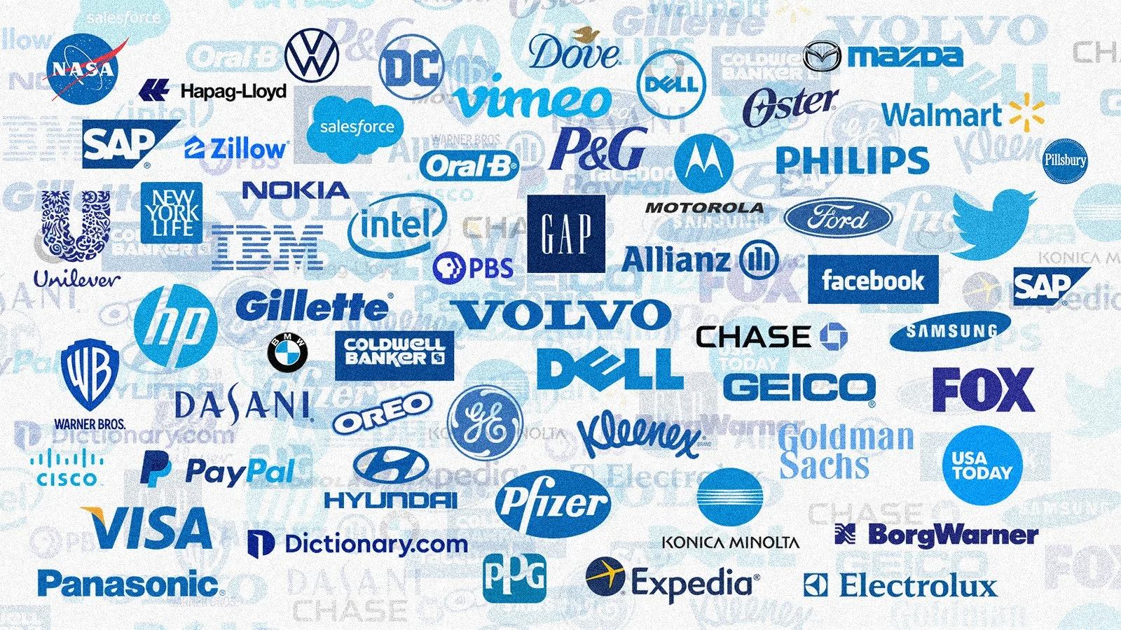
Don’t get lost in a sea of sameness.
Blue is not alone in this, either. Red, black, grey and sometimes even green can be the safe bet in a corporate brand package. Just look around you in a parking lot or on the commute to work and observe the most popular car colors right now.

Where did I park my car?
So why is this the norm today? It wasn’t always like this. Cars in the 1960s and 1970s were sold in bright, loud, fashionable colors. Home appliances and furniture in lively, aggressive colors were common in every home. Clothing and fashion showed personality and life. Art and music were electric, and color was everywhere. Today, you can buy a new car in black, white or 13 shades of gray.
Color makes a statement in everything you do.
We as a society now intuitively fall back to safety. Don’t stir up emotion. Don’t rock the boat. But in business and branding, this can have a net zero or even negative result.
Follow along with me on this one, and I’m going to underline and highlight this one because it’s important.
When there is no contrast anywhere, nothing stands out.
That’s it—that’s the message that needs to be screamed from the rooftops. When you look like everyone else, you make yourself invisible and forgettable. Is that the best thing for your brand? Of course it isn’t. In fact, it’s rather detrimental to any brand to have no identity or style that you can call your own.
To be fair, there are plenty of people and companies that are not memorable. Not everyone needs or wants to stand out in a crowd. I get that. But if you want to be different, and stand above your competitors, color is an excellent and simple means to go about starting. It’s the easiest way to show contrast with everyone else. It’s something that you can own—something people will instantly associate with you or your product.

Nothing runs like a Deere.
Do you believe that John Deere tractors are green because it represents earthiness, growth, nature and health? Nope. When they were founded in the mid-1800s, they painted their tractors green to stand out from all of their competitors’ red tractors on the farms. They added the yellow wheels in order to identify them easier from far away in a field. John Deere knew something about branding and contrast 150 years ago. They just didn’t have internet marketing bloggers writing 1500 words telling you about emotional colors and psychological effects of green in your brand guide.

When you think of brown, what is the first company that comes to mind? Of course it’s UPS. They completely own brown, to the point that they used it in their brand messaging—“What can brown do for you?” They are literally telling you that their color represents who they are. Brown has become part of their image. Sixteen years after that campaign ended, it’s still embedded into our brains. They completely own it. Anyone in that space that takes a shade of brown is trying to build something that isn’t them, and it is not authentic. Everyone can see right through. Would you use a shipping company that was trying to attach their brand to another company by mimicking that brand? I wouldn’t, and most people would agree.
So what colors should you use in your brand? Such a simple question—and yet, many layers of answers.
Before anything else, you really need to look around and see what your competitors are doing well—and poorly—with their own brands. Not so that you can parrot what they are doing, but so that you can carve out a place of your own in the competitive landscape. If there are multiple major competitors using orange as their primary brand color, you should really steer away from that color completely. Remember that John Deere tractor—you gain nothing by looking like everyone else.
Choose brand colors that represent who you are as a company. IKEA takes this and runs with it, slathering the Swedish national colors all over their brand. If you see a big blue building from the highway, you don’t need to see the signage to know what that business is. Spot a Tiffany robin’s-egg-blue box under someone’s arm at a store around the holidays, and you know exactly where it came from. Tiffany literally owns that color. That’s brand awareness, and it’s marketing currency.
More complex approaches to brand colors involve really looking into what your company represents and believes. Authenticity in any brand goes a long way in connecting to your preferred audience. Is your brand fun and youthful, but still professional? Pick brand color palettes that represent how you want people to see you. If you look old and stodgy, that’s what people will think you are—even if that’s not really the personality of your company.
As someone who has spent a career trying to bring fresh, new ideas to clients that want to grow, stand out and be memorable, my recommendations for brand success are simple:
Make it personal. Humans certainly connect on an emotional level, but the ultimate connection is when you make your brand message true to who you are.
Be authentic. You being you. Be true to your own core image and brand—nothing else counts. No one else can be you.
Show contrast. When everyone else zigs, you zag. If you want to be memorable, forge your own brand path and own it.
So when making brand color decisions for your company, I absolutely want you to think about what your competitors are doing. And then, do something different.