
Introducing the Salt Lake City Sasquatch

Jack King, Senior Designer
A blessing and a curse for the staff of Ivor Andrew: when we see branding that truly makes no sense, it doesn’t leave our minds until we can fix it.
And if you want branding that makes no sense, look no further than the Utah Jazz.
Is Utah known for its jazz scene?
No. Very much not. Hence the terrible branding.
New Orleans, however, has a legendary jazz culture. Which is why the basketball franchise, originally based in Louisiana, had a name that fit perfectly.
But in 1979, the Jazz migrated west to Salt Lake City. And because ownership did not have enough time before the start of the season for the league to approve a name change, they kept the original.
The Utah Jazz. Perfectly inaccurate for nearly 50 years.
HOWEVER. We believe “this is the way we’ve always done it” is not a good enough reason to keep doing it. And so, we put the I//A design team to work.
The result: the Salt Lake City Sasquatch.
That’s pretty out there.
Sure is. Some serious minor league baseball vibes, as a matter of fact. That’s no accident.
During a morning creative meeting, we got to talking about the minor leagues and how unique the logos and team names are. The Yard Goats, the Biscuits, the Trash Pandas. We wanted our Jazz fix to evoke that same sort of feeling. Something fun and unexpected.
What other names were considered?
The Utah Raptors clearly would have been perfect. Unfortunately, the Raptors are up north in the NBA already. Another one we got a kick out of was the Utah Yukon Corneliuses, aka the dude from Rudolph, the Red-Nosed Reindeer. Doesn’t roll off the tongue, though. And plus, the whole copyright infringement thing.
With a little more research, we found Utah tends to have regular Bigfoot sightings. That was all we needed to hear. And so, SLC Sasquatch was born: just goofy enough while still being plenty plausible.
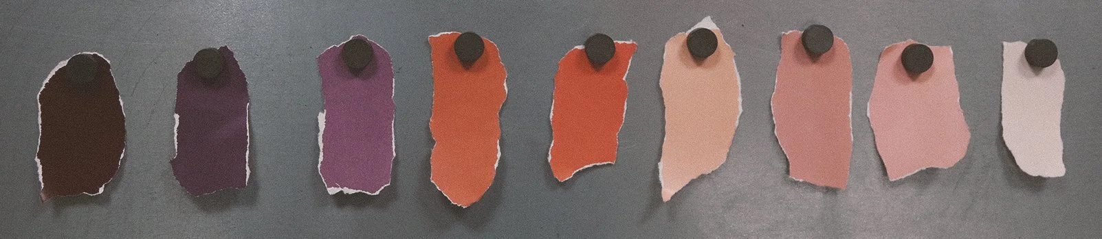
“I wanted to move away from the original and retro color palettes of the Utah Jazz and give them something unique—and still Utah. A lot of the inspiration I took was from the red rocks out there, from the earthy brown and tan tones.”
-Jack King, I//A Senior Designer
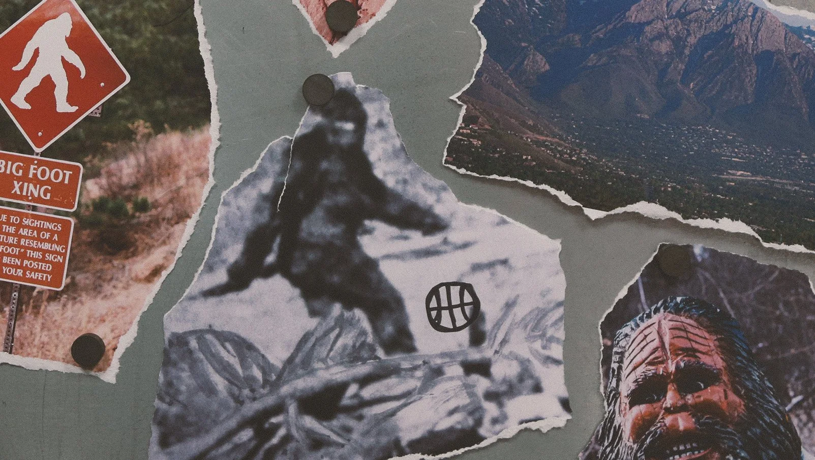
“The famous original Bigfoot video from 1967 was my main inspiration for the pose of the sasquatch. That famous frame actually looks like he could be dribbling a basketball, too. The other element I wanted to incorporate were the mountains that surround Salt Lake City.”
-Jack again

Remember: just because something has always been done one way doesn’t mean it can’t be changed and improved.
On that note, Ivor Andrew creates lasting brands and campaigns for some of the finest B2B companies in the world. Need us to take a look? Ask about a brand audit today.